Как сделать боковое меню из Zero со сдвигом в Tilda

A house of many lights: combining invention and tradition
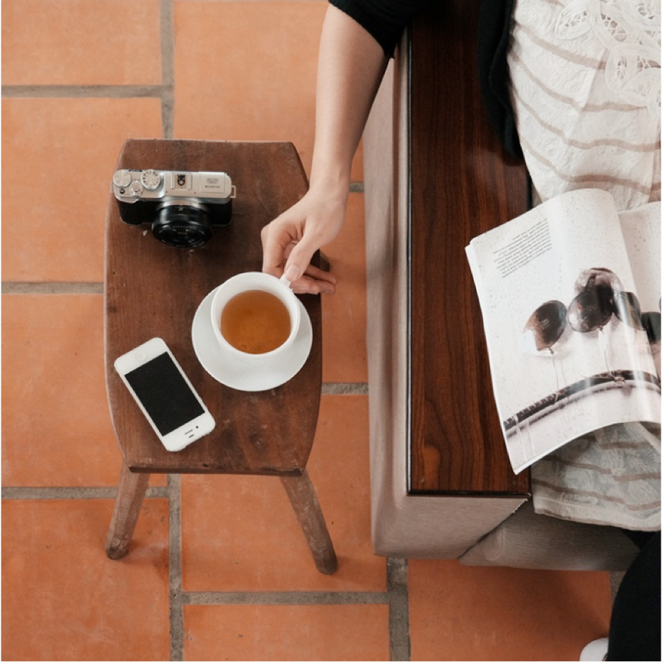
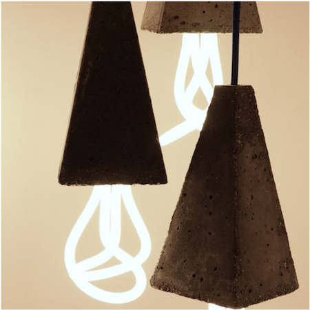
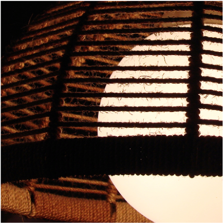
Many Lights is a collection of lamps and chandeliers curated by Neville and Marie. Our buyers travel the world in search of the most unique lamps — every one of them has a character and a history. See what we've got in our web store, and find the one that'll fit your home interior.
Developments in printing technology, ink, and paper making, made it possible to print letterforms of high contrast and delicate hairlines.
Founder & Art Director
Design Director
Customers Support
Max Holden
Lucy Good
Eva Stark
Core team
The smartest people work every day to provide the best service and to make our clients happy
Max invented our company. He is the father of our main goals and values. He has founded first core members of our team and helped them to show their unique talents in work process. He made a really important first steps.
People say that our company is associated with beauty and quality. Julia takes care of everything you see. She spent five years in London learning visual communication and design. She uses her knowledge to make the world a little more beautiful.
Eva is the voice of our brand. She spends hours to make our clients feel care and enjoy communication with the company. If you have any suggestions or ideas you can write her. Eva like to get clients letters and feedback.
Как сделать боковое меню из ZeroBlock со сдвигом в Tilda
1
Создали ZeroBlock для меню, привязки элементов WindowContainer-Right-Top
2
Оставили справа отступ 85px и поместили в него элемент html c кодом кнопки закрытия
<div class="menuicon"><span></span><span></span><span></span>
<div class="menubg"></div> </div>
<div class="menuicon"><span></span><span></span><span></span>
<div class="menubg"></div> </div>
3
Под остальной контент меню оставили ширину 330px
4
Добавили коды на страницу в блок Другое Т123
Библиотека для примера: меню
<style>
div.leftmenu {
    position: fixed;
    z-index: 99;
    top: 0;
    width: 100%;
    left: calc(-100% + 85px);
}
.leftmenuopen {
    transform: translateX(330px);
}
div.leftmenu div[data-elem-type="text"] .tn-atom {
    transition: all 1.0s ease-in-out;
    transition-delay: 0.5s;
}
div.leftmenu div[data-elem-type="text"] {
    transition: all 0.2s ease-in-out;
}
div.leftmenuopen div[data-elem-type="text"] .tn-atom {
    color:#fff !important;
}
div.leftmenuopen div[data-elem-type="text"]:hover {
    padding-left: 30px;
    transform: skewX(-30deg);
}
div.leftmenu div[data-elem-type="text"] a:before {
    content: "";
    width: 10px;
    height: 10px;
    position: absolute;
    left: 0;
    top: calc(50% - 5px);
}
div.leftmenuopen div[data-elem-type="text"]:hover a:before {
    background-color: #fff;
}
#allrecords , div.leftmenu{
    transition: all 0.8s cubic-bezier(0, 0, 0.2, 1);
}
.rightslide{
padding-left: 330px;
}
@media screen and (max-width:1200px){
.leftmenuopen {
    transform: translateX(260px);
}
}
@media screen and (max-width:640px){
div.leftmenu.leftmenuopen {
    transform: translateX(0px);
    left: 0;
}
.rightslide {
    padding-left:0px;
}
}

</style>
<script>
$(document).ready(function(){
$('div#rec234724225').addClass('leftmenu');

function leftmenuclose(){
   $('.menuicon').removeClass('mvleft');
   $('.leftmenu').removeClass('leftmenuopen');
   $('#allrecords').removeClass('rightslide');
};
$('.menuicon').click(function() {
    $(this).toggleClass('mvleft');
    $('.leftmenu').toggleClass('leftmenuopen');
    $('#allrecords').toggleClass('rightslide');
});
$('.leftmenu a').click('on', function() { leftmenuclose()});
$(document).click( function(e){ if ( $(e.target).closest('.leftmenuopen').length ) {return}  leftmenuclose();});
$(document).keydown(function(eventObject){	if( eventObject.which == 27 || eventObject.which == 32 ){leftmenuclose();};});
});
</script>
Библиотека для примера: эффект для кнопки
<style>
.menuicon {
    width: 100%;
    height: 100%;
    cursor: pointer;
    border-radius: 50%;
    border: none;
    outline: none;
    position: relative;
    padding: 0;
}
.menubg {
    background-color: #000;
    position: absolute;
    width: 100%;
    height: 100%;
    border-radius: 50%;
    z-index: -1;
    pointer-events: none;
    transition: all 1.0s ease-in-out;
    transition-delay: 0.5s;
}
.menuicon.mvleft .menubg{
    transform:scale(50);
}

.menuicon span {
  position: absolute;
  width: 40px;
  height: 4px;
  top: 50%;
  left: 50%;
  background: #fff;
  border-radius: 2px;
  overflow: hidden;
  transition: all 0.3s linear;
}
.menuicon span::before {
  content: "";
  position: absolute;
  width: 0;
  height: 100%;
  top: 0;
  right: 0;
  background: gray;
  transition: all 0.3s linear;
}
.menuicon span:nth-child(1) {
  animation: span-first-off 0.5s ease-in-out;
  animation-fill-mode: forwards;
}
.menuicon span:nth-child(2) {
  animation: span-second-off 0.5s ease-in-out;
  animation-fill-mode: forwards;
}
.menuicon span:nth-child(3) {
  animation: span-third-off 0.5s ease-in-out;
  animation-fill-mode: forwards;
}

.mvleft:hover span::before {
  width: 100%;
  transition: all 0.3s linear;
}
.mvleft span:nth-child(1) {
  animation: span-first-on 0.5s ease-in-out;
  animation-fill-mode: forwards;
}
.mvleft span:nth-child(2) {
  animation: span-second-on 0.5s ease-in-out;
  animation-fill-mode: forwards;
}
.mvleft span:nth-child(3) {
  animation: span-third-on 0.5s ease-in-out;
  animation-fill-mode: forwards;
}

@keyframes span-first-on {
  0% {
    transform: translate(-50%, -300%);
  }
  30% {
    transform: translate(-50%, -50%);
  }
  100% {
    transform: translate(-50%, -50%) rotate(-45deg);
  }
}
@keyframes span-first-off {
  0% {
    transform: translate(-50%, -50%) rotate(-45deg);
  }
  30% {
    transform: translate(-50%, -50%) rotate(0deg);
  }
  100% {
    transform: translate(-50%, -300%);
  }
}
@keyframes span-second-on {
  0% {
    transform: translate(-50%, -50%);
  }
  25% {
    background: gray;
  }
  50% {
    transform: translate(-50%, -50%) scale(1);
  }
  100% {
    transform: translate(-150%, -50%) scale(0);
  }
}
@keyframes span-second-off {
  0% {
    transform: translate(-150%, -50%) scale(0);
  }
  25% {
    background: gray;
  }
  50% {
    transform: translate(-50%, -50%) scale(1);
  }
  100% {
    transform: translate(-50%, -50%);
  }
}
@keyframes span-third-on {
  0% {
    transform: translate(-50%, 200%);
  }
  30% {
    transform: translate(-50%, -50%);
  }
  100% {
    transform: translate(-50%, -50%) rotate(45deg);
  }
}
@keyframes span-third-off {
  0% {
    transform: translate(-50%, -50%) rotate(45deg);
  }
  30% {
    transform: translate(-50%, -50%) rotate(0deg);
  }
  100% {
    transform: translate(-50%, 200%);
  }
}

</style>