

Ура, вы выиграли!
Ваш приз:
Годовой доступ
к видео на mo-ti -20%
по промокоду T19RAY
Промокод действителен 3 дня
Оформить доступ с промокодом
Ваш приз:
Годовой доступ
к видео на mo-ti -20%
по промокоду T19RAY
Промокод действителен 3 дня
Оформить доступ с промокодом
100
#2470a1 Ура, вы выиграли!
Ваш приз:
Бесконечный доступ
к видео на mo-ti -20%
по промокоду BYP877
Промокод действителен 3 дня
Оформить доступ с промокодом
Ваш приз:
Бесконечный доступ
к видео на mo-ti -20%
по промокоду BYP877
Промокод действителен 3 дня
Оформить доступ с промокодом
100
#19547b Ура, вы выиграли!
Ваш приз:
Курс по HTML+CSS
со скидкой -20%
по промокоду B1JUMZ
Промокод действителен 3 дня
Записаться с промокодом
Ваш приз:
Курс по HTML+CSS
со скидкой -20%
по промокоду B1JUMZ
Промокод действителен 3 дня
Записаться с промокодом
100
#2470a1 Ура, вы выиграли!
Ваш приз:
Годовой доступ
к видео на mo-ti -25%
по промокоду 9HV09P
Промокод действителен 3 дня
Оформить доступ с промокодом
Ваш приз:
Годовой доступ
к видео на mo-ti -25%
по промокоду 9HV09P
Промокод действителен 3 дня
Оформить доступ с промокодом
100
#2470a1 Ура, вы выиграли!
Ваш приз:
Бесконечный доступ
к видео на mo-ti -25%
по промокоду L1WBTH
Промокод действителен 3 дня
Оформить доступ с промокодом
Ваш приз:
Бесконечный доступ
к видео на mo-ti -25%
по промокоду L1WBTH
Промокод действителен 3 дня
Оформить доступ с промокодом
100
#19547b Ура, вы выиграли!
Ваш приз:
Годовой доступ
к видео на mo-ti -30%
по промокоду HJ7LC8
Промокод действителен 3 дня
Оформить доступ с промокодом
Ваш приз:
Годовой доступ
к видео на mo-ti -30%
по промокоду HJ7LC8
Промокод действителен 3 дня
Оформить доступ с промокодом
100
#2470a1 Ура, вы выиграли!
Ваш приз:
Бесконечный доступ
к видео на mo-ti -30%
по промокоду 8GYA8Y
Промокод действителен 3 дня
Оформить доступ с промокодом
Ваш приз:
Бесконечный доступ
к видео на mo-ti -30%
по промокоду 8GYA8Y
Промокод действителен 3 дня
Оформить доступ с промокодом
100
#19547b Ура, вы выиграли!
Ваш приз:
Курс по HTML+CSS
со скидкой -30%
по промокоду JS7KZQ
Промокод действителен 3 дня
Записаться с промокодом
Ваш приз:
Курс по HTML+CSS
со скидкой -30%
по промокоду JS7KZQ
Промокод действителен 3 дня
Записаться с промокодом
100
#19547b Услуги
- Модификация стандартных блоков
- Изменение визуала карточек товара
- Модификации блоков магазина и корзины
- Изменение логики работы скидок, промокодов, доставки
- Создание нестандартных слайдеров
- Создание сложных калькуляторов
- Обмен данными со сторонними сервисами
- Настройка платёжных систем, систем рассылки писем, сервисов доставки
- Формирование изображений или pdf для скачивание, отправка на почту клиента
- Нестандартные решения с необычной логикой
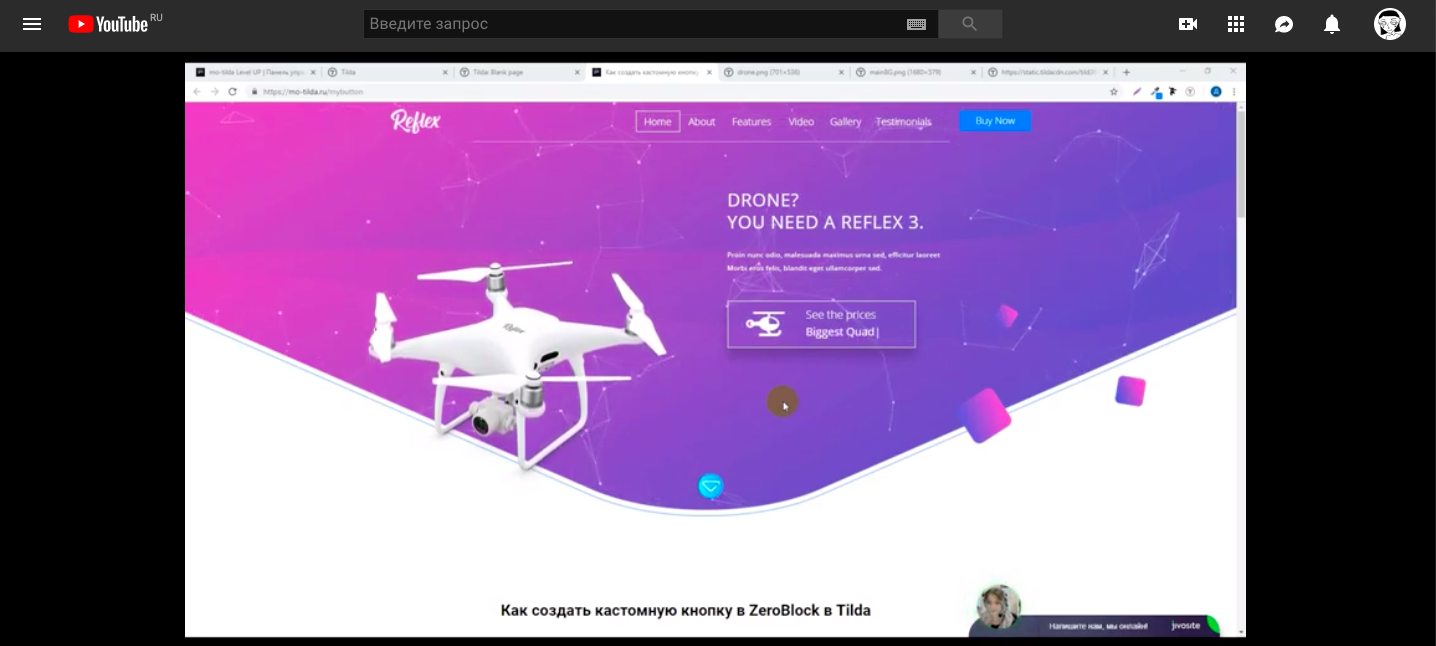
Как сделать кнопку с градиентом в ZeroBlock в Tilda

 +1-2345-2234
 sales@goodlayers.co
PROFESSIONAL STUDIO IN
LONDON.
Founded in 2008 by professional photographer, John Smith. We product visual content full-service creative to post production. Ultimately our mission is to help people to see beauty in themselves.
VIEW OUR WORKS

Creativity is to discover a question that has never been asked. If one brings up an idiosyncratic question, the answer he gives will necessarily be unique as well.
Как сделать кнопку с градиентом в ZeroBlock в Tilda
1
Создали ZeroBlock
2
Добавили в него элемент Button/Кнопка и присвоили ей ссылку класс aboutme ( или ссылку #aboutme)
3
Добавили на страницу код в блок ДРУГОЕ►Т123
Цвета можно настроить в этой строке
background-image: linear-gradient(45deg , #FFD115 60%, #ff5959);
45deg - угол направления градиента
Ссылку можно написать свою!!
Цвета можно настроить в этой строке
background-image: linear-gradient(45deg , #FFD115 60%, #ff5959);
45deg - угол направления градиента
Ссылку можно написать свою!!
Mo-ti Level Up
Видео инструкции по добавлению кода и работе с Zero Block.
Создаём градиент для кнопки и других элементов. Изменяем параметры градиента прямо на сайте.
Длительность видео: 47 минут
Длительность видео: 47 минут
Фрагмент видео

Библиотека для примера с классом
<style>
/*Эффект для кнопки*/
.aboutme .tn-atom {
    background-image: linear-gradient(45deg , #FFD115 60%, #ff5959);
    box-shadow: 0 16px 32px 0 rgba(255, 141, 0, 0.35);
    background-position: 100% 0 !important;
    background-size: 200% 200%;
    transition: all 0.5s ease-in-out !important;
}
/*Эффект для кнопки*/
.aboutme .tn-atom:hover {
   box-shadow: 0 0 0 0 rgba(0,40,120,0);
   background-position: 0 0 !important;
}
</style>
Библиотека для примера со ссылкой
<style>
/*Эффект для кнопки*/
[href='#aboutme'] {
    background-image: linear-gradient(45deg , #FFD115 60%, #ff5959);
    box-shadow: 0 16px 32px 0 rgba(255, 141, 0, 0.35);
    background-position: 100% 0 !important;
    background-size: 200% 200%;
    transition: all 0.5s ease-in-out !important;
}
/*Эффект для кнопки*/
[href='#aboutme']:hover {
   box-shadow: 0 0 0 0 rgba(0,40,120,0);
   background-position: 0 0 !important;
}
</style>